The State of CSS
May 25, 2017It’s no secret that we are currently experiencing a Cambrian explosion of innovation by the JavaScript community. But what you may not be aware of are the equally evolutionary innovations under development by the CSS community.
CSS has quietly been improving by leaps and bounds lately. So much so, that you may not even recognize it much anymore. While you weren’t looking, the CSS community has developed real solutions to many of the oddities, hacks, and deficiencies that made CSS the black sheep of the front end family in the past.
In this post I’ll reveal 5 old-fashioned CSS things that you don’t need to do anymore, and what you should do instead.
- You don’t need a naming convention.
- You don’t need float.
- You don’t need a grid framework.
- You don’t need a preprocessor.
- You don’t need CSS.
You don’t need naming conventions.
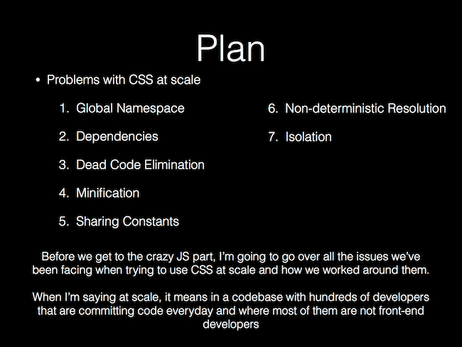
And we begin with the number one problem with CSS, especially at scale: everything is global.
 Source:
https://speakerdeck.com/vjeux/react-css-in-js
Source:
https://speakerdeck.com/vjeux/react-css-in-js
Because all selectors exist in the same global namespace, over time it becomes very likely that you’ll run into unexpected side effects such as selectors targeting elements that you didn’t intend, or selectors being overridden by other selectors. So, we have side-stepped these issues with methodologies (OOCSS, SMACSS, or the more popular BEM) that define naming conventions to help us avoid class name collisions.
While we can’t discount the importance of these methodologies, they are merely a workaround. They don’t actually solve the problems. We needed something more. And then this happened.
 Source:
https://medium.com/seek-blog/the-end-of-global-css-90d2a4a06284
Source:
https://medium.com/seek-blog/the-end-of-global-css-90d2a4a06284
Mark Dalgleish and others have since pioneered the concept of locally scoped CSS, which led to the development of CSS Modules, and which has now been incorporated into modern tooling, most notably webpack’s css-loader.
// webpack.config.js

{
  test: /\.css$/,
  use: [
    {
      loader: 'css-loader',
      options: {
        modules: true,
        localIdentName: '[path][name]__[local]--[hash:base64:5]'
      }
    }
  ]
}
This is huge. When using CSS Modules, name your classes however you like. At build time, all local selectors are replaced by unique identifiers, completely removing the need for a global naming convention. Check out the docs above for CSS Modules for a deeper dive.
While this technology was born from component-oriented front-end development (think React), you can also get support for CSS Modules everywhere.
You don’t need float.
Float has managed to become both the positioning property of choice and the bane of many a developer’s existence by weaseling its way into everything from helper classes to entire grid systems. While occasionally using float to push an element left or right doesn’t get you into too much trouble, pervasive use of it for full page layouts leads to odd behavior that is a pain to figure out and fix, often requiring hacks. Pretty soon you find yourself copying the admittedly elegant, yet unintuitive “clearfix” onto every element and hoping for the best.
Thankfully, CSS3 introduced a new layout module called flexible boxes, or Flexbox for short. Flexbox is a mostly 1-dimensional layout system that ensures elements behave predictably on various screen sizes and devices. It also solves the common, yet previously frustrating task of vertical and horizontal centering. When you switch to Flexbox, you no longer have any use for float.
See the Pen GmbYjd by Ryan Oglesby (@ryanoglesby08) on CodePen.
While Flexbox is fully supported by all modern browsers, you will run into issues on older ones. So, if you have to support IE < 10 you will likely still need to fall back to floats, tables, or some other layout method.
Some browsers also need vendor prefixes, so I recommend using Autoprefixer to get the most coverage.
You don’t need a grid framework.
Everyone uses a grid. It’s a crucial part of every CSS codebase, letting you build complex full-page layouts by aligning elements along rows and columns. While rolling your own simple grid using traditional techniques is fairly straightforward, no one does it. Instead, we reach for one of the many grid frameworks, such as the original 960gs or the Sass-based Bourbon Neat.
Finally, as of March 2017, most browsers added support for the CSS Grid Layout, a 2-dimensional layout system built directly into CSS. Since most traditional grid frameworks still rely on float, CSS Grid is an attractive alternative. CSS Grid makes it easy to define your own grid without the help of a framework by providing an intuitive interface for defining the number and sizes of rows and columns, the gutter spacing, alignment of elements within the grid, named areas, and more.
See the Pen pwzNdB by Ryan Oglesby (@ryanoglesby08) on CodePen.
At the time of writing this article, CSS Grid is supported by all modern browsers, with partial support on IE if you use vendor prefixes (use Autoprefixer).
You don’t need a preprocessor.
Undeniably, CSS language extensions such as Sass and Less brought game-changing features to CSS, including data reuse with variables, better organization with nesting, and property reuse with mixins. But, these languages didn’t change anything about the core language of CSS; they added a layer of abstraction on top of it. In the case of Sass, you also need an additional binary to compile the Sass files into CSS. When using one of these preprocessors, you now have to learn CSS and the preprocessor specific syntax.
But, while most developers were blissfully coupling to their preprocessors, CSS was quietly progressing. Modern browsers now have native support for CSS variables and calc(). Other features such as color modifications, and mixins are not far behind.
:root {
  --spacing: 1.5em; /* declaring a variable */
  /* declaring a mixin */
  --base-colors: {
    color: #fff;
    background-color: color(#fff shade(+80%)); /* modifying a color */
  }
}

.some-class {
  padding: var(--spacing);
  width: calc(100% - var(--spacing)); /* dynamically calculating a value */
  @apply --base-colors;
}
Fortunately for CSS, the JavaScript community has already had the problem of browsers not supporting new features fast enough, which led to Babel, giving JavaScript developers everywhere access to “next generation JavaScript, today.” Similarly, PostCSS is a “tool for transforming CSS with JavaScript”, which gets its power from the extensive list of community maintained plugins. CSS developers can even “use tomorrow’s CSS syntax, today” with the cssnext PostCSS plugin.
Writing plain CSS and transforming it with PostCSS plugins produces more future-proof CSS with less cognitive and technical overhead than old preprocessors.
You don’t need CSS.
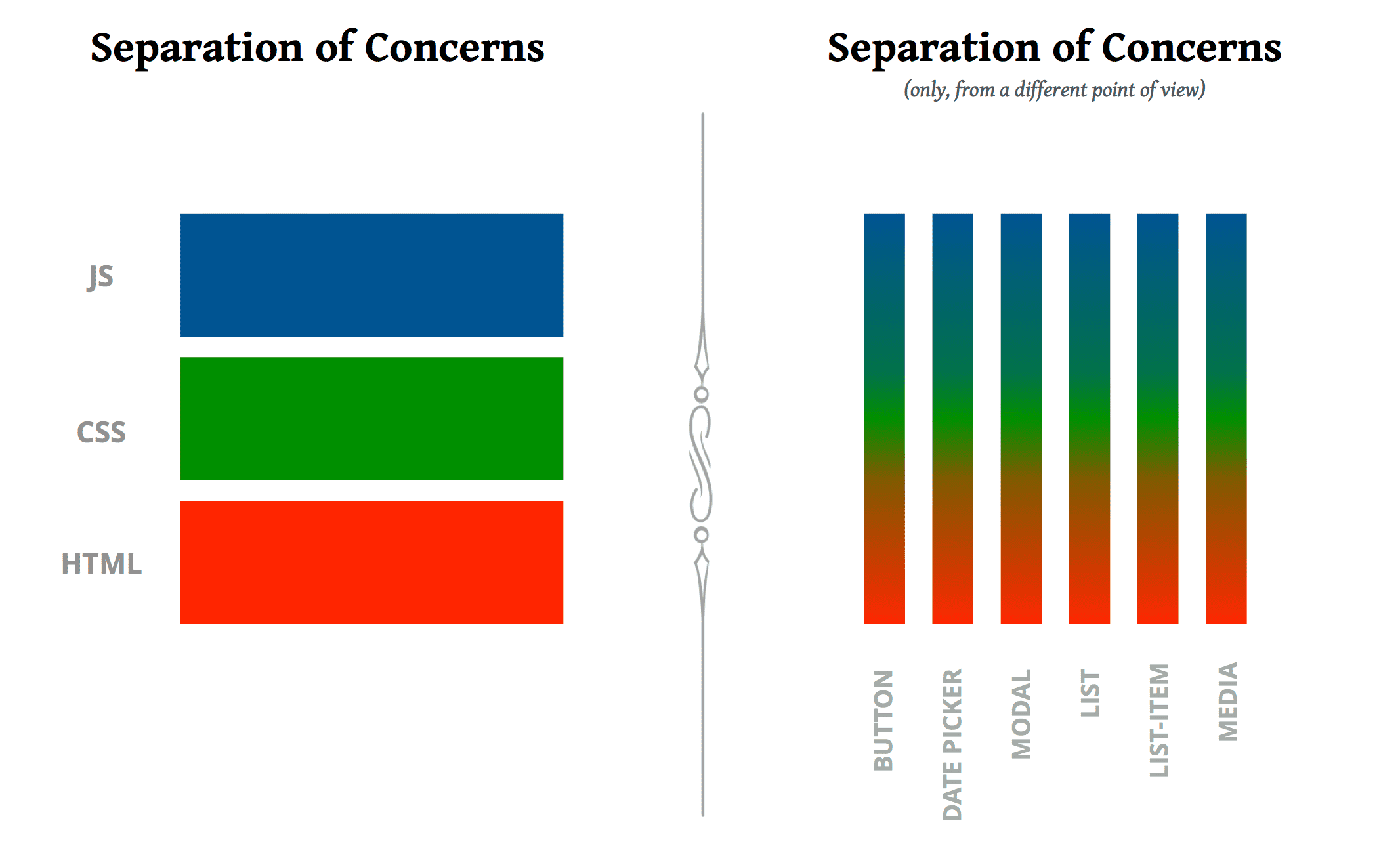
Ok, so that’s not entirely true. While CSS remains the only document styling language that browsers understand, you can style web applications without ever writing a single .css file. With the help of UI libraries such as React or Vue.js, modern web application architecture has embraced loosely coupled, highly cohesive components that often co-locate HTML, CSS, and JavaScript in the same file. Interestingly, this idea is in direct contradiction to previously held best practices around separation of these concerns. (This conference talk, called “Rethinking best practices” gives a great explanation.)
 Source:
https://speakerdeck.com/didoo/let-there-be-peace-on-css
Source:
https://speakerdeck.com/didoo/let-there-be-peace-on-css
From a CSS perspective, this rethinking has even been given a catchy name: CSS-in-JS.
At first, CSS-in-JS libraries used the HTML “style” attribute to attach styles onto elements, a flawed approach because the “style” attribute can’t do everything CSS can do. Now, most libraries generate real style sheets with the full power of CSS, eschewing use of the “style” attribute for the most part.
Writing CSS using JavaScript addresses most of the other points I’ve brought up in this article. Most new libraries scope styles automatically, make reuse of classes easy and efficient, identify and inline critical-path CSS for faster initial load times, and enable real modular sharing of open-source CSS packages. This must-read article outlines the architectural benefits for CSS-in-JS and is the best I’ve read so far.
As this space is new and exciting, there has been an explosion of libraries (this list is even slightly old now). This is a good thing. It will take some time to settle down as the community discovers best practices, such as avoidance of the “style” attribute, proper support for media queries, and the ability to use proper CSS syntax instead of a JavaScript object.
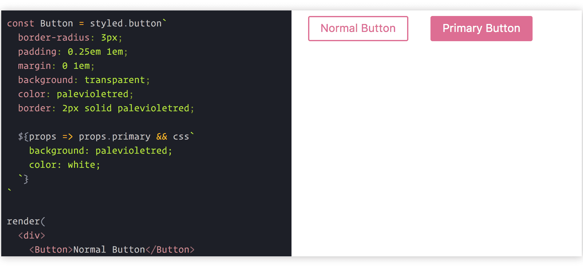
JSS is a very popular choice, with an active community and a stable interface; but I’m especially excited about the direction of styled-components, which cleverly attaches CSS to components via tagged template literals.
 Source:
https://www.styled-components.com
Source:
https://www.styled-components.com
CSS is dead. Long Live CSS.
- You don’t need naming conventions because locally-scoped styles by default are now baked-in to libraries.
- You don’t need float because Flexbox is more powerful and less hacky.
- You don’t need a grid framework because there’s one built into CSS.
- You don’t need a preprocessor because CSS has more advanced features now.
- You don’t need CSS because writing styles in JavaScript enables more architectural and community benefits.
I’m excited about the large-scale adoption of modern JavaScript techniques and UI libraries, especially React. But, I’m frustrated at the same time because those same codebases continue using dated, flawed CSS techniques and technologies instead of embracing modernity. It’s time we recognize the importance of these new developments in the CSS community and find a way out of our old, comfortable habits.