Exposing CSS Hidden Complexities with React
November 18, 2017When we create web applications we use style sheets to describe presentation, and we use JavaScript to manage all the bits of state and logic. Unfortunately, we often end up with style sheets full of complexity, such as stateful pseudo-classes, style rule overrides through media queries, and deceivingly complicated animations. But what if we could leverage the expressiveness of React to take control of all of this?
Complexity is a concern better handled with JavaScript, not style sheets. If we push complexity from style sheets into JavaScript, then it becomes more obvious and predictable, thus easier to deal with.
This post is an exploration of this hypothesis applied to 3 common CSS features:
- Pseudo-classes
- Media queries
- Animations
I’ve also created an accompanying Github repo with full, working examples of all the snippets shown in this post.
Motivation
While evaluating CSS-in-JS libraries for my current project recently, I did a deep dive on React Native for Web. The library’s philosophy and direction really resonated with me, and like many CSS-in-JS implementations it has many benefits over traditional CSS at scale. If you haven’t seen it yet check it out!
The Style FAQs in the documentation caught my eye:
“Media Queries may not be most appropriate for component-based designs. React Native provides the Dimensions API and onLayout props. If you do need Media Queries, using the matchMedia DOM API has the benefit of allowing you to swap out entire components, not just styles.”
“Pseudo-classes like :hover and :focus can be implemented with events (e.g. onFocus). Pseudo-elements are not supported; elements should be used instead.”
Because React Native for Web relies on React Native implementations to be cross-platform compatible, it eschews some CSS features in favor of JavaScript implementations. This makes a lot of sense even if you are not trying to build a cross-platform app. So, I decided to explore this concept further, without using React Native for Web.
A “simple” button
Here is the example I’ll be using, a “simple” button component and its accompanying style sheet.
/* Button.css */

button {
  display: inline-block;
  min-width: 200px;

  background-color: #2892d7;
  transition: background-color 0.5s;
}

button:hover {
  background-color: #1d70a2;
}

@media (max-width: 767px) {
  button {
    display: block;
    width: 100%;
  }
}
// Button.js
import React from "react";
import "./Button.css";
export default ({ children }) => (
<button>{children}</button>;
)Full component: https://github.com/ryanoglesby08/exposing-css-hidden-complexities/tree/master/src/components/CssButton
Goodbye pseudo-classes, hello setState
First up is the :hover pseudo-class. One of the key tenants of React and other UI libraries is
that they pull state out of the DOM and into your components so that it is easier to reason about.
CSS Pseudo-classes are a direct contradiction to this advantage. In order for the button to change
it’s background color, something must know whether or not the mouse is currently “hovering” over the
button. The DOM is doing that. The DOM is managing an implicit state of “mouse is over the button”
or “mouse is not over the button”. The component should be managing that state, not the DOM.
So, I’ll refactor the Button component to use the onMouseEnter and onMouseLeave events and
React’s setState.
/* Button.css */

button {
  display: inline-block;
  min-width: 200px;

  transition: background-color 0.5s;
}

@media (max-width: 767px) {
  button {
    display: block;
    width: 100%;
  }
}
// Button.js
import React, { Component } from 'react'
import './Button.css'
const bgColors = {
default: '#2892d7',
hover: '#1d70a2',
}
export default class Button extends Component {
state = {
hover: false,
}
toggleHover = () => {
this.setState({ hover: !this.state.hover })
}
render() {
const { children } = this.props
return (
<button
onMouseEnter={this.toggleHover}
onMouseLeave={this.toggleHover}
style={{
backgroundColor: this.state.hover ? bgColors.hover : bgColors.default,
}}
>
{children}
</button>
)
}
}Full component: https://github.com/ryanoglesby08/exposing-css-hidden-complexities/tree/master/src/components/HoverButton
A more power media query
Media queries suffer from the same contradiction as pseudo-classes. There is an implicit state of “the media query is matched” or “the media query is not matched” that should be managed by JavaScript.
While pure CSS media queries are powerful, they tend to result in overriding of previously defined style values, which can often cause unwanted side effects and mistakes due to specificity errors. As the React Native for Web docs point out, they also are constrained to adjusting styles only. They can’t be used to swap out entire components.
Next, I’ll move the media queries out of the style sheet, preferring the
window.matchMedia DOM API
instead. react-media is a nice little package that
provides a component interface for window.matchMedia.
/* Button.css */

button {
  transition: background-color 0.5s;
}

.inline {
  display: inline-block;
  min-width: 200px;
}

.fullWidth {
  display: block;
  width: 100%;
}
// Button.js
import React, { Component } from 'react'
import Media from 'react-media'
import './Button.css'
class Button extends Component {
// same as previous Button.js snippet
}
export default ({ children }) => (
<Media query={{ maxWidth: 767 }}>
{matches =>
matches ? (
<Button className="fullWidth">{children}</Button>
) : (
<Button className="inline">{children}</Button>
)
}
</Media>
)Full component: https://github.com/ryanoglesby08/exposing-css-hidden-complexities/tree/master/src/components/ResponsiveButton
Animations as components
The final thing to tackle here is the transition. For all but the most experienced CSS wizards out
there, CSS animations or transitions can be really challenging. Moreover, they require the
combination of multiple style rules working together.
In this case, transition: background-color 0.5s describes a state change of the property
background-color. When the background-color property of the button changes to another value,
either through a class being added or removed, or a style property being edited, the background will
shift from its previous value to its new value over a timespan of 0.5 seconds. It’s pretty complex,
and this is a very simple transition.
Finally, I’ll bring the transition into the component with the react-transition-group package, which lets you describe a transition from one component state to another over time with a simple declarative API.
// BgColorShift.js

import React from 'react'
import { Transition } from 'react-transition-group'

const defaultStyle = (startBgColor, timeout) => ({
  transition: `background-color ${timeout}ms`,
  backgroundColor: startBgColor,
})

const transitionStyles = endBgColor => {
  return {
    entering: { backgroundColor: endBgColor },
    entered: { backgroundColor: endBgColor },
  }
}

export default ({ start, end, children, ...rest }) => (
  <Transition {...rest}>
    {status => {
      const styles = {
        ...defaultStyle(start, rest.timeout),
        ...transitionStyles(end)[status],
      }

      return children(styles)
    }}
  </Transition>
)
// Button.js
import React, { Component } from 'react'
import BgColorShift from './BgColorShift'
import './Button.css'
const bgColors = {
default: '#2892d7',
hover: '#1d70a2',
}
class Button extends Component {
// ... setState stuff
render() {
const { className, children } = this.props
return (
<BgColorShift
timeout={500}
in={this.state.hover}
start={bgColors.default}
end={bgColors.hover}
>
{bgColorStyles => (
<button
onMouseEnter={this.toggleHover}
onMouseLeave={this.toggleHover}
style={bgColorStyles}
>
{children}
</button>
)}
</BgColorShift>
)
}
}
// export default with the Media query componentFull component: https://github.com/ryanoglesby08/exposing-css-hidden-complexities/tree/master/src/components/AnimatedButton
I can write tests for this stuff now!
One of the big wins as I moved complexity into JavaScript was the increased level of testability. There weren’t any tests that really made sense when all the UI behavior was implemented in a style sheet. Writing tests for these things takes some of the burden off of manual visual checks, creates documentation of the visual language, and helps prevent future regressions.
Here are some of the tests:
// Button.spec.js

it('changes background color on hover', () => {
  const button = mount(<Button>Press me</Button>)

  button.simulate('mouseEnter')
  expect(button.find('button')).toHaveStyle('backgroundColor', '#1d70a2')

  button.simulate('mouseLeave')
  expect(button.find('button')).toHaveStyle('backgroundColor', '#2892d7')
})

it('is full width on small viewports', () => {
  // Setup mock for `window.matchMedia` because test is running in jsdom
  const matchMedia = jest.fn()
  matchMedia.mockImplementation(() => ({
    matches: true,
    addListener: () => {},
    removeListener: () => {},
  }))
  global.matchMedia = matchMedia

  const button = mount(<Button>Press me</Button>)

  expect(button.find('button')).toHaveClassName('fullWidth')
})
My insights
Maybe the most obvious “downside” here is that the total amount of code has increased, by a lot. I’ve written less CSS, but much more JavaScript, and I’ve added 2 third-party libraries… just to make a button.
Let’s be clear here, my stated goal was not to create the most clever, most terse button. It was to expose complexities hidden in CSS so that I could identify complexity, reason about it more easily, control it, and test it. React actually has similar goals. React has never said that it’s goal is to produce solutions with minimal lines of code. Rather, it aims for declarative components, predictability, and JavaScript-controlled logic (https://reactjs.org/). The most clever solution is often the least understandable.
This is what good real world React code often looks like. Nothing wrong with it being verbose and explicit. Don’t mistake terse for clean! https://t.co/qjB685FnuJ
— Dan Abramov (@dan_abramov) November 17, 2017
Pros and cons
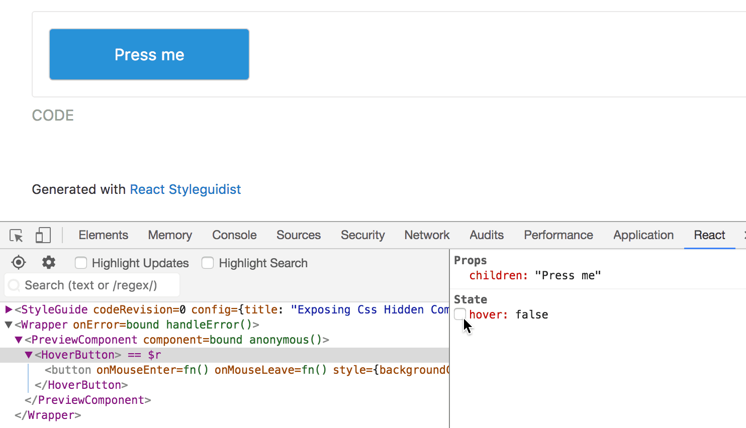
- If you regularly use your browser’s dev tools to debug/play with the styles of your components,
the JavaScript approach changes that a bit. For example, most dev tools let you trigger a
pseudo-class such as
:hover. That will no longer have a visible effect. Instead, use the React dev tools to programmatically interact with your components.
-
I get really nervous when I see CSS or Sass that has a lot of nesting and overriding of style rules. I like how the final CSS file I ended up with was flat. All style rules are static, there is no nesting, and nothing is overridden by another class. Ahhhhh, peace.
-
I’m pretty excited about encapsulating common visual concerns into reusable components with a single responsibility. In this exploration I identified a reusable media query component and an animation component that could be extracted. In another project I’ve started extracting layout components such as
Boxto control spacing, andFlexboxto control 1-dimensional layout. Check out these libraries for more: https://sapegin.github.io/react-spaceman/ and https://github.com/jxnblk/reflexbox. -
Finally, I was not able to write a test for the transition that I was completely satisfied with. Transitions and animations are inherently time based, which does not play nicely with unit testing. The best I could do was take before and after snapshots and then rely on manual visual checks to make sure the transition looked proper while it was running. But, with a reusable
BgColorShiftcomponent now at my disposal, I can now trust it’s behavior, making future transitions easier to implement.